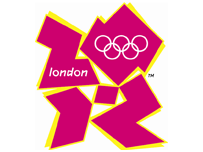
London 2012 - like bad pink graffiti

So, the 2012 London Olympics logo... I love it!
In the way that I really hate it, think it is absolutely disgusting and ugly and a massive waste of money (£400k - how? why?!).
First reaction on seeing it at some point yesterday lunchtimeish was an interesting mixture of laughing and disgust. Seriously?
But apparently it's meant to be aimed at the 'youth' of Britain, quite possibly in the same slightly cringy way that politicians like to think they are 'cool' and 'down with the kids'. So not at all then...
Not found anyone saying anything good about it yet either, heh. But the whole reaction I am finding hilarious ![]() Didn't take long for b3ta types to get their hands on it, but then the best thing ever happened and the beeb actually picked up on a rather obvious goatse version. Genius! Part of me hopes this was down to someone at the bbc with a slightly twisted sense of humour, rather than just general ignorance. heh.
Didn't take long for b3ta types to get their hands on it, but then the best thing ever happened and the beeb actually picked up on a rather obvious goatse version. Genius! Part of me hopes this was down to someone at the bbc with a slightly twisted sense of humour, rather than just general ignorance. heh.
But no, it gets better! Today someone important has decided that the animated version (which I have avoided seeing) may trigger epileptic fits. Good to see that all that money has gone on really properly researching every aspect of the project then. duuuh.
Oh yeah, and rather predictably the designers' website is a big mess of nasty flash that is in no way accessible to anyone. Why am I not surprised by this?

 tags:
tags:
Ewww
Amelie | 6th Jun 07 16:06
to me it looks like a woman giving a (slightly deformed) guy a blow job
Mark | 7th Jun 07 5:53